Edustripe — School Management
System
broken_img

DESCRIPTION

Edustripe were doing a total redesign of their platform to provide friendly and innovative service to their customers. They needed a UX designer to help rebrand and redesign their website. The team reached out to me and we discussed via zoom on how I can change their story and make their website more user friendly.

ROLE

UX Designer

Year

2020

TASK

Redesign website

Duration

8 weeks

PROBLEM
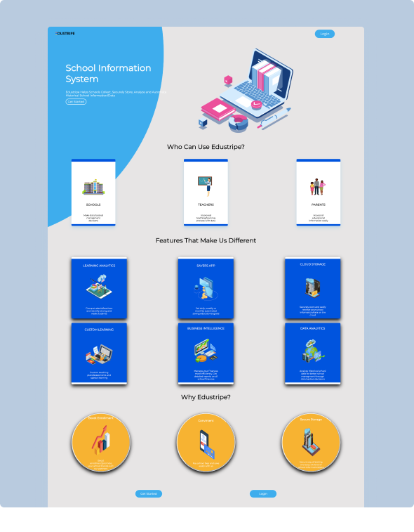
The old website didn’t reflect the dynamics of the company and was poorly designed. The use of colors and text formatting was shoddy and was not passing the message it should.
broken_img

PROBLEM

The old website didn’t reflect the dynamics of the company and was poorly designed. The use of colors and text formatting was shoddy and was not passing the message it should.

DESIGN PROCESS

The solution was to redesign the whole website from scratch to give it a new and more pleasing experience to users.


01. Understanding existing user

The first task was to understand the brand’s attribute from its customer base because I don’t want to design for the wrong audience. After Identifying the brand’s audience, I got to know their interaction story with the current website and competitor’s websites then I designed my action plan.


02. UX audit

I filled my coffee cup and sat to write down what was wrong with the current website and what could have been better, so I will not end up recreating the same shoddy design. The color composition made the website look outdated, the choice of font format made the website feel plain and the pages were not responsive to clicks or hovers.


03. Redesigning

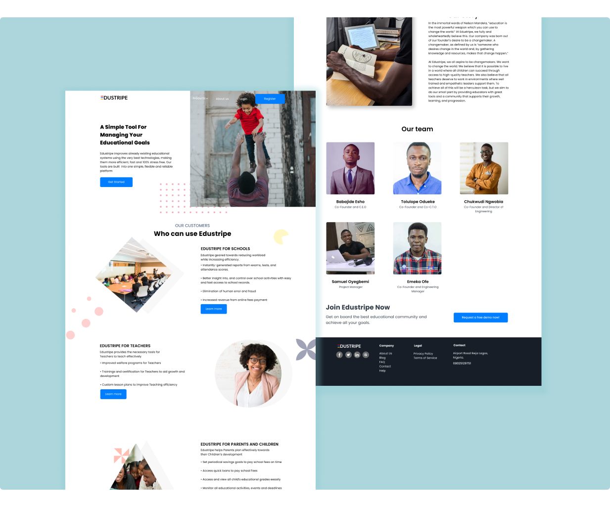
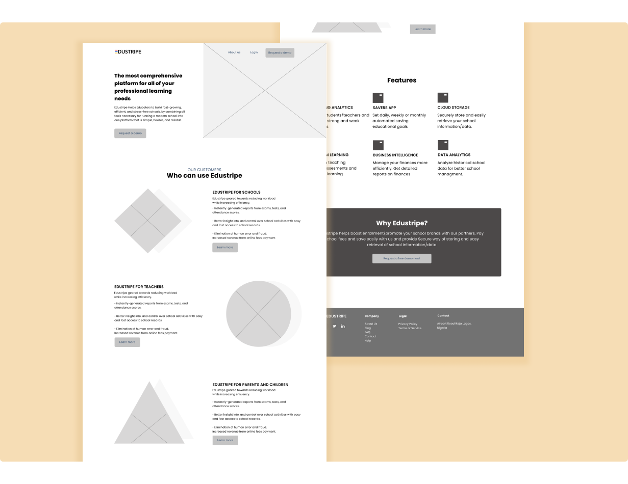
Once I organized all the research and defined my solution, I began to explore potential design for the website. The Landing page and about page was the first page I redesigned as these are the first pages you see when you visit the a site.
broken_img
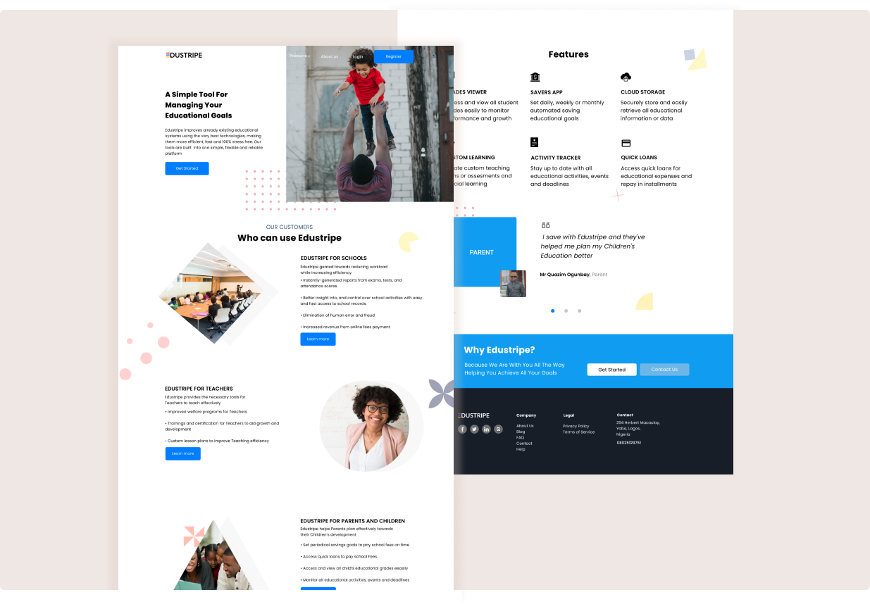
After going several hours on the wireframe and implementing feedback from all concerned stakeholders, I decided to design the high fidelity mockup.

broken_img


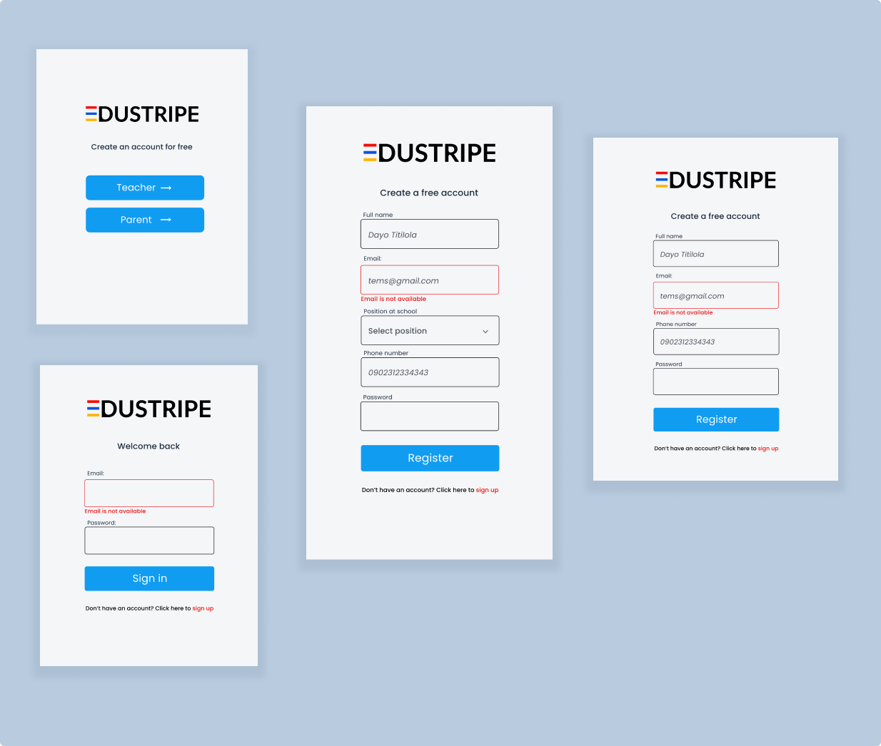
The authentication screens had to be simple and frictionless to have positive impact on the user.

broken_img


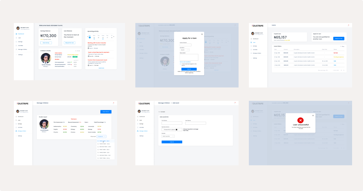
Other screens

broken_img

CONCLUSION

After several weeks making strides to make the platform awesome and deliver great user experience, I still keep updating and have design reflections to make it better.

Work inquiry, question or just a friendly hello? Email me